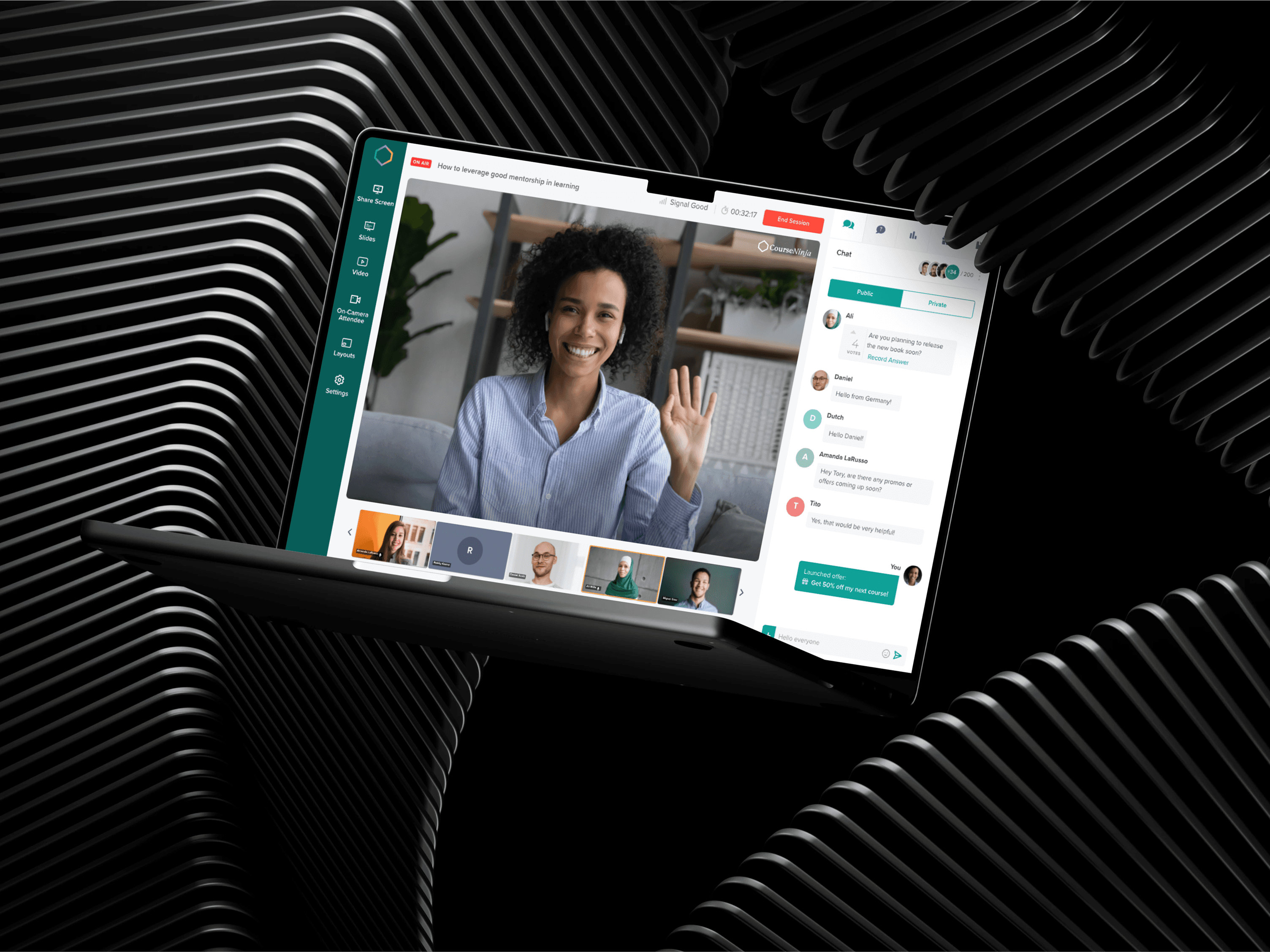
Building design…
Shuttlers
Shuttlers
Shuttlers
What happens when you Can’t Trust your Ride or Know When it will Arrive?
What happens when you Can’t Trust your Ride or Know When it will Arrive?
What happens when you Can’t Trust your Ride or Know When it will Arrive?

Project Details
Team:
Product Designer (Me)
2 Product Managers
5 iOS & Android Engineers
Customer Support Team
Project Deliverables:
Design System
Hi Fidelity UI,UX Design
Wireframes & Flow Charts
Developer Handoff Files
My Role:
Product Design
Experience Design
Research & Discovery
Prototyping & Testing
Tools:
Figma, Maze, Power BI
Year:
2022
Overview
TL;DR
Imagine booking a ride to work days in advance, only to be left wondering if the shuttle is actually on its way on a work day. That was a common frustration for Shuttlers app's users before the redesign.
Shuttlers is a mobility-as-a-service platform that enables corporate workers to book affordable, shared rides to and from the office. While the idea was sound, the user experience needed work — Shuttles real-time tracking often felt like a gamble, booking flows had friction points leading to user drop offs, and driver engagement was slipping. Shuttlers wanted to provide more transparency, speed, and confidence in the ride experience—for both riders and drivers.
My role as the Product Designer was to lead the end-to-end redesign of both the Customer App and Driver App — transforming them into intuitive, efficient tools that empowered both passengers and drivers.
Why were Users Dropping Off?
The Problem
Despite its growing user base, the Shuttlers' experience was lacking in key areas:
Booking a ride was
clunkyanderror-prone, leading to unnecessarydrop-offs.Riders experienced
inaccurate ETAs, making it hard to trust the app during peak hours.Drivers struggled with
navigation clarityandtrip management.Customer confidencewas dipping due to poor and unreliable shuttle experience.
What did we do?
The Solution
We approached this like a "cross-functional relay race". I worked closely with business stakeholders, engineers, product managers, data analysts, customer support, drivers and riders to do a full product revamp and restore trust and user satisfaction.
This included:
Redesigning the
Customer App’s ride bookingandreal-time shuttle trackingexperience.Rethinking the
Driver App’s trip navigationandtrip management.Introducing a more
cohesive design systemto improve consistency and scalability of both platforms.Leveraging
data, user feedback, andresearch insightsto guide design decisions.
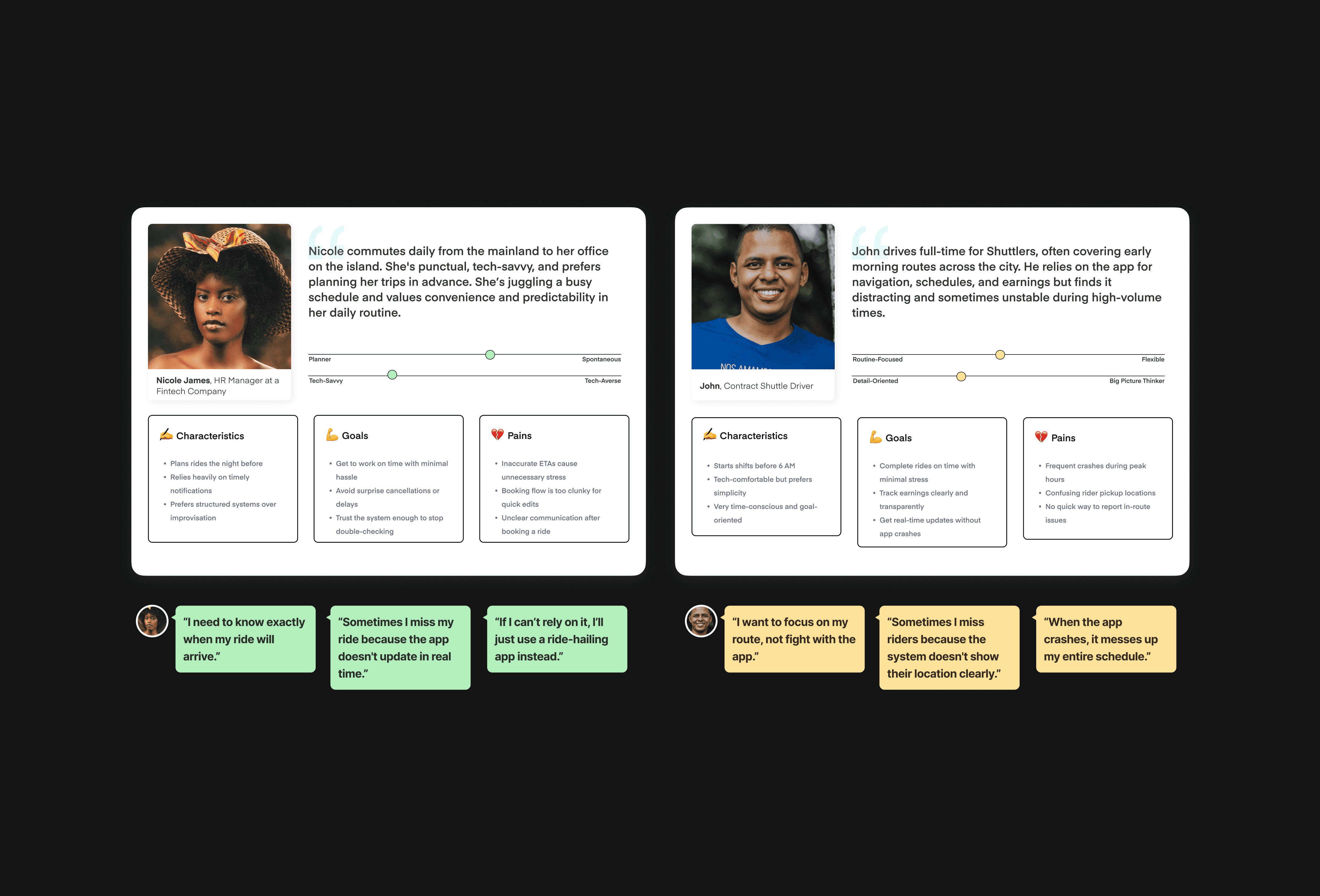
Research & Discovery
Setting the stage for the work
As we set out to redesign the Shuttlers Customer and Driver Apps, I knew we had to go beyond the interface — we had to understand the daily routines, frustrations, and expectations of the real people who relied on the service to get to work on time, every day. This phase was all about listening, watching, and translating human behaviours into insights.
Conversations that Shaped the Design
User Interviews, Surveys, Ride-alongs and Shadowing Users
We engaged in deep conversations with both rider and driver groups, while also sending short in app surveys to about 1000+ customers to broaden our feedback pool. From early mornings at pickup points to shadowing shuttle drivers and passengers on busy routes, we immersed ourselves in the commute experience.
Some recurring themes quickly surfaced:
Riders often felt uncertain about when their shuttle would arrive, especially during delays.
Drivers lacked a streamlined way to manage trips.
Both groups expressed frustration with inconsistent app performance and ambiguous UI elements.
Rider Insight #: “I never really know when the shuttle will arrive. Sometimes it's on time, sometimes 15 minutes late."
Driver Insight #:“As a driver, I find the trip view confusing—especially when I have multiple stops.”
This gave us direct access to the anxieties, friction points, and habits shaping the Shuttlers experience.
Competitive Benchmarking
Learning from the Mobility-Tech Ecosystem
I researched how ride-sharing and mobility apps like Swvl, Uber and Bolt handled similar user journeys. While some competitors had polished features like live tracking and ETA notifications, they lacked tailored solutions for fixed-route, corporate commute systems like Shuttlers. This gap became an opportunity to design something uniquely optimized for scheduled corporate rides.
Key learnings from competitive analysis:
Competitors excelled at
live trackingandETA updates, but lacked support forpre-scheduled,fixed-route commutes.Few platforms clearly visualized
who was on boardor handledmulti-passenger pickupsin a corporate context.The
driver experiencewas often under-designed.
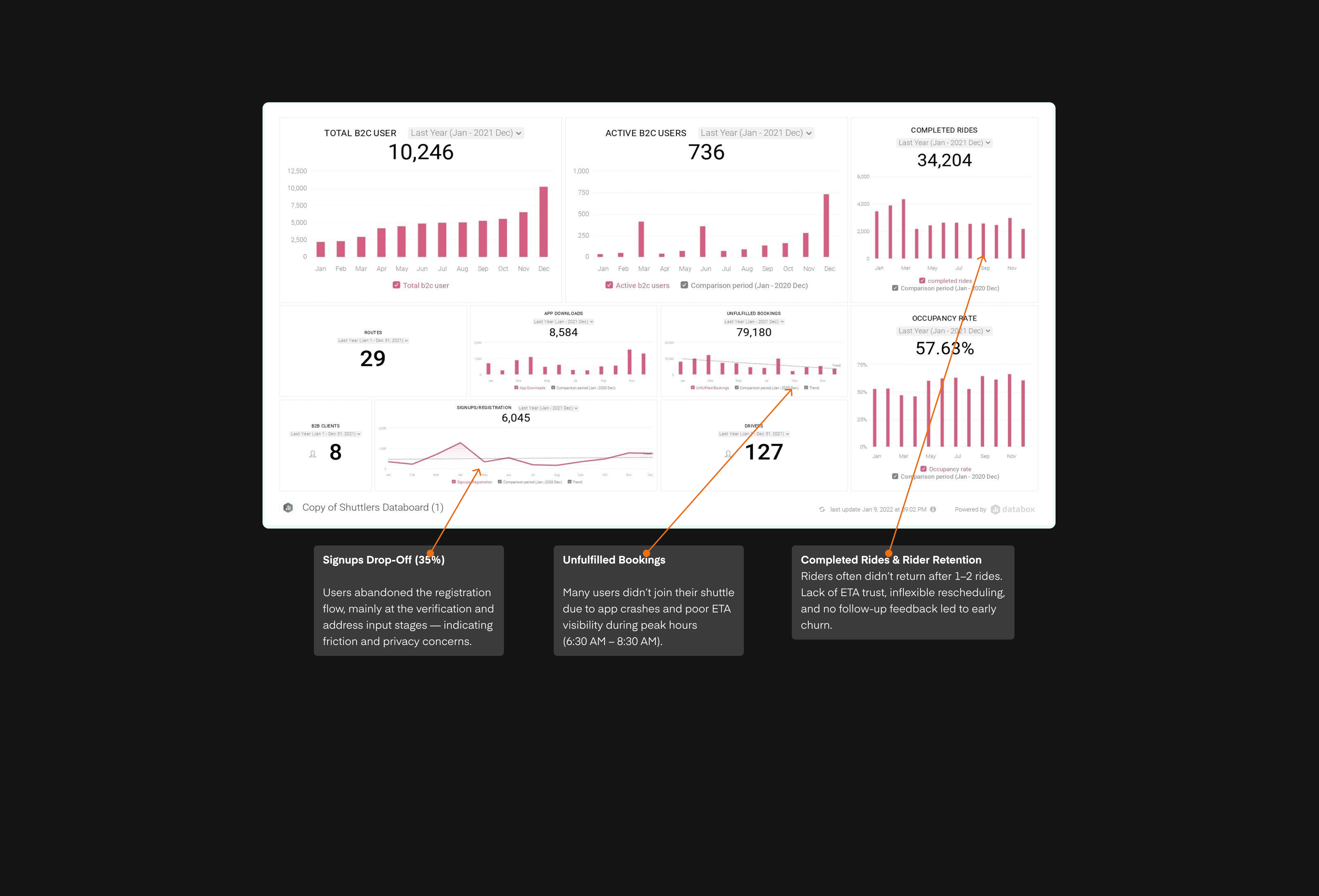
Analytics Reviews
Patterns the Data whispered
Using Power BI dashboards, I analyzed over 30,000 user sessions and behavioural trends over the past 90 days.
Here’s what stood out:
22% of scheduled rides were never taken, often because users missed their shuttle or weren’t sure if it had arrived.Ride booking drop-off rate was 35%— users would start the booking process but abandon it before completion.App usage peaked between 6:30 AM – 8:30 AM, with frequent crashes during that window, highlighting poor stability during high-stakes moments.
Pairing these quantitive findings with qualitative insights gave me a more holistic understanding of both what was broken and when it hurts the users most.
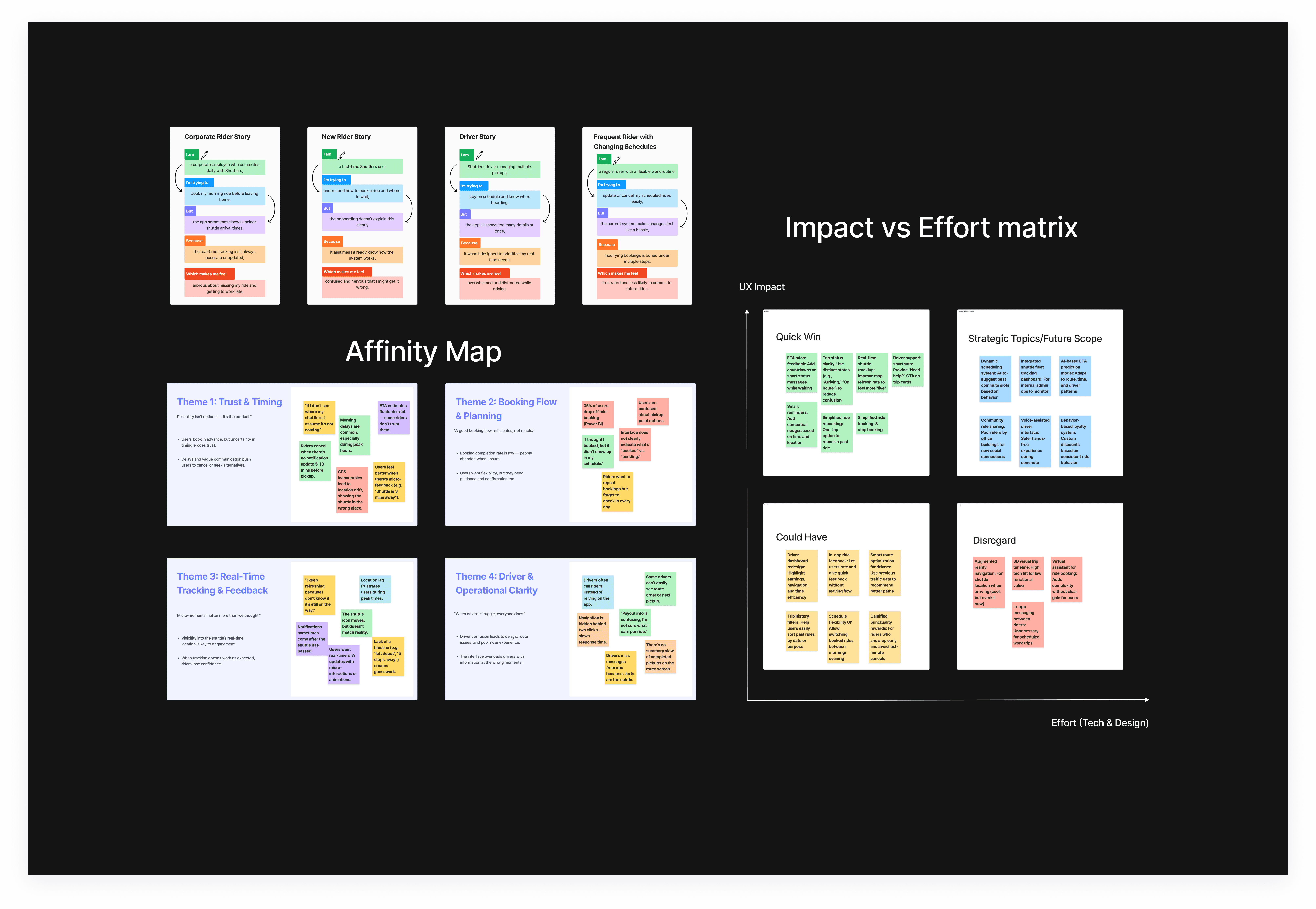
Synthesis & Key Research Insights
Turning Pain Points into Opportunities
After synthesizing interviews, quantitative data, and competitive analysis insights, we saw clear opportunities to reduce friction, increase confidence, and differentiate Shuttlers in the mobility-tech space.
Here are some major takeaways:
Rider's Trust is Time-Based
Riders cancel when ETAs feel vague or unreliable — clarity builds commitment.
Rider's Trust is Time-Based
Riders cancel when ETAs feel vague or unreliable — clarity builds commitment.
Rider's Trust is Time-Based
Riders cancel when ETAs feel vague or unreliable — clarity builds commitment.
Rider's Trust is Time-Based
Riders cancel when ETAs feel vague or unreliable — clarity builds commitment.
Drivers Need Clarity, Brevity
Showing drivers what matters most (navigation, route, time) improves focus.
Drivers Need Clarity, Brevity
Showing drivers what matters most (navigation, route, time) improves focus.
Drivers Need Clarity, Brevity
Showing drivers what matters most (navigation, route, time) improves focus.
Drivers Need Clarity, Brevity
Showing drivers what matters most (navigation, route, time) improves focus.
Predictability Builds Loyalty
Showing the user exactly where their shuttle is and ETAs, keeps them engaged.
Predictability Builds Loyalty
Showing the user exactly where their shuttle is and ETAs, keeps them engaged.
Predictability Builds Loyalty
Showing the user exactly where their shuttle is and ETAs, keeps them engaged.
Predictability Builds Loyalty
Showing the user exactly where their shuttle is and ETAs, keeps them engaged.
The Design Approach
Thoughtful Design for Trust and Reliability.
After a deep dive into rider and driver frustrations, the design process became less about aesthetics and more about reassurance. I wasn't just designing a ride-hailing app — I was designing predictability, reliability, and confidence in a service meant to simplify the everyday life of actual humans.
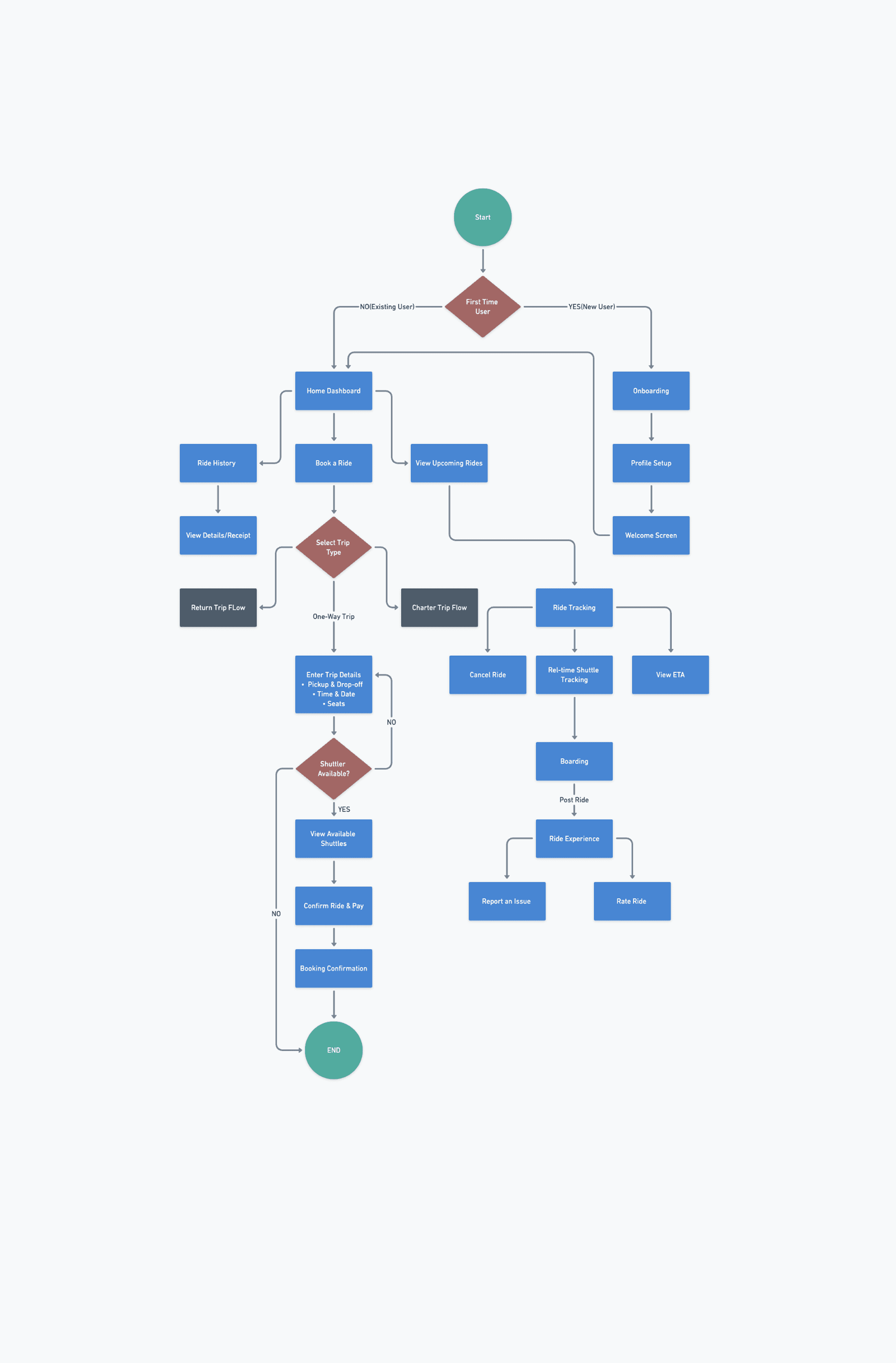
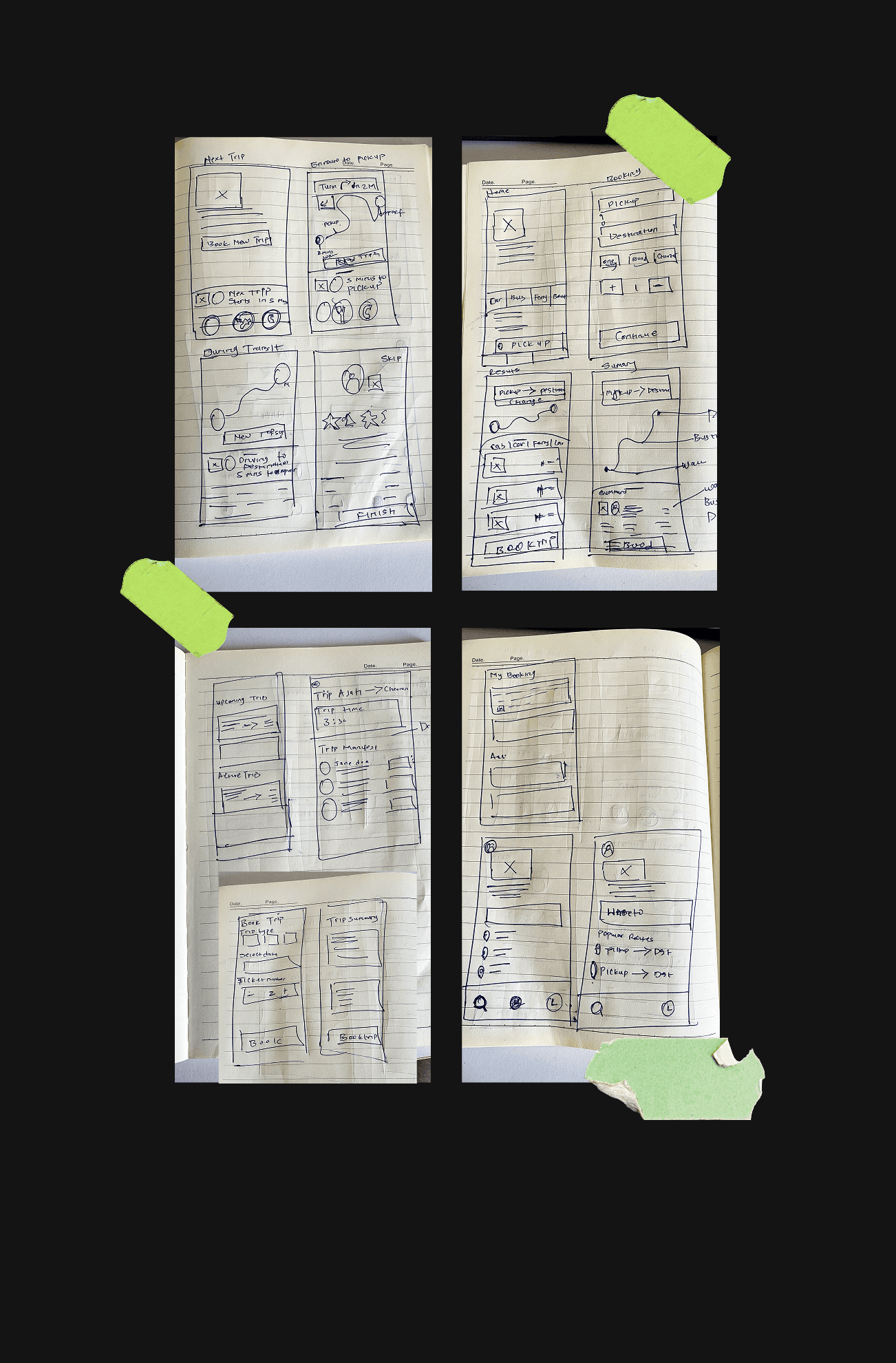
Simplifying the Booking Flow
User Flow & Wireframes
Data from Power BI showed a 35% drop-off rate during ride booking. Users often got stuck mid-flow or lost confidence before confirmation.
To fix this, I streamlined the entire flow to reduce cognitive load:
Reduced the booking steps from 6 to 3.
Introduced real-time fare estimation upfront & Added contextual cues.
I also introduced
smart defaults— pre-selecting common routes and time windows based on previous patterns. This tiny tweak alone sped up the booking process by an average of51 seconds.
🧠 Learning: Speed isn't always about faster taps — it’s about making users feel like the app already knows what they need.
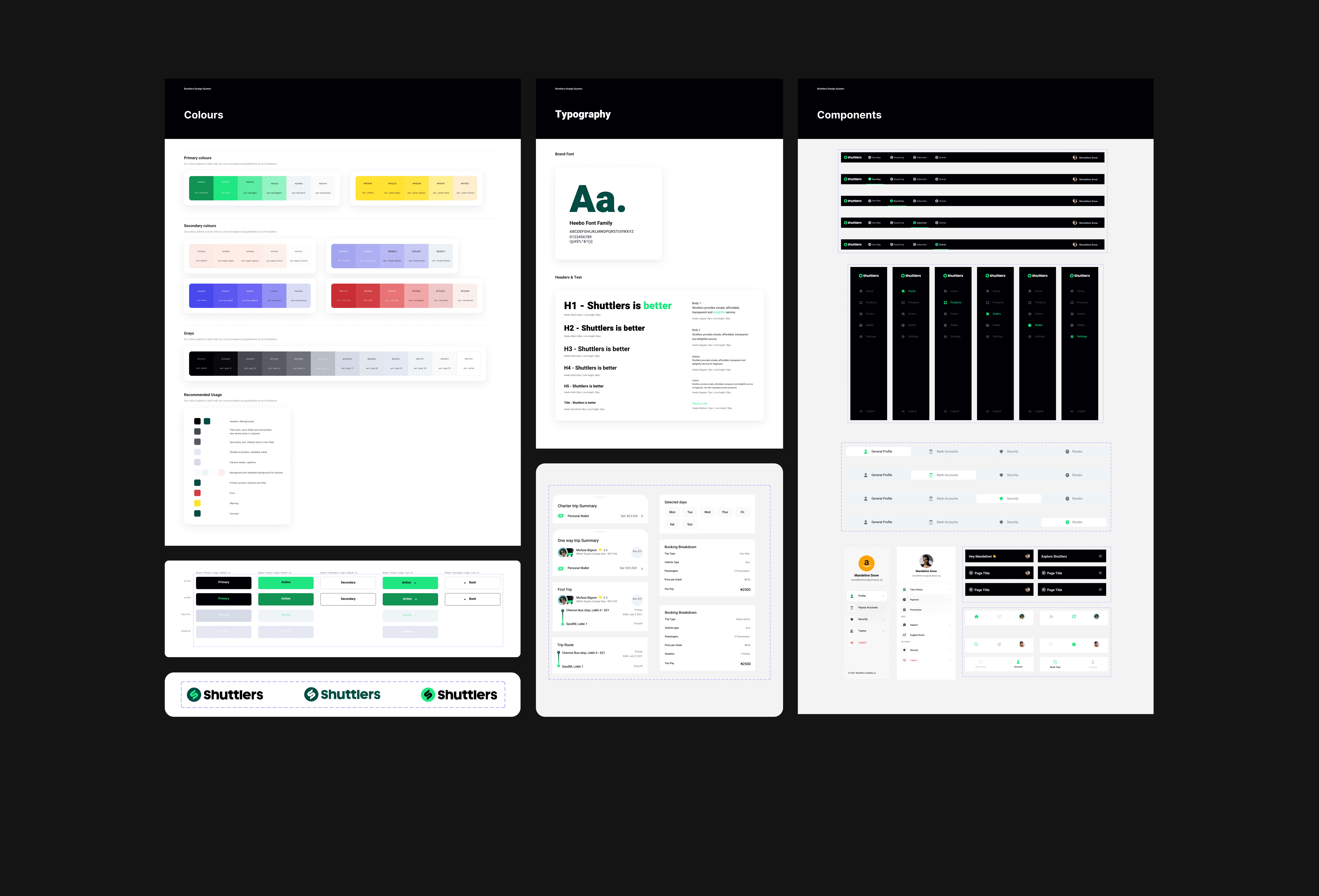
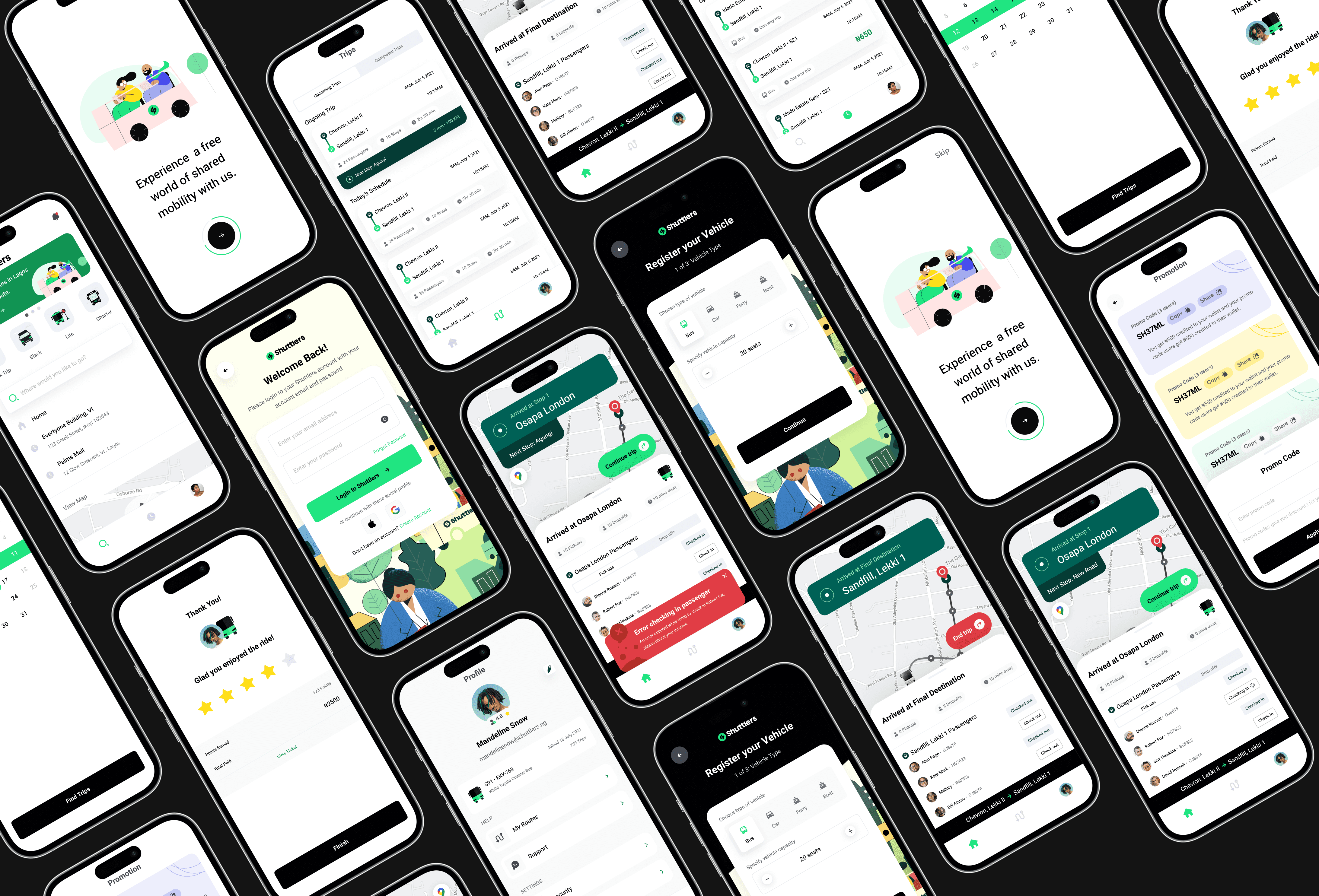
UI Audit & Visual Language Cleanup
A Scalable Design System
I audited the existing product's visual language. There were inconsistencies in button styles, design components, layout, spacing, and typography across both the rider and driver apps, leading to confusion and visual fatigue.
To fix this, I created a Design System using Figma — introducing a clean, modular design style that balanced functionality with a fresh, modern aesthetic.
🎨 Outcome: This reduced design inconsistencies, sped up development handoff, and built a foundation for scalable UI improvements.
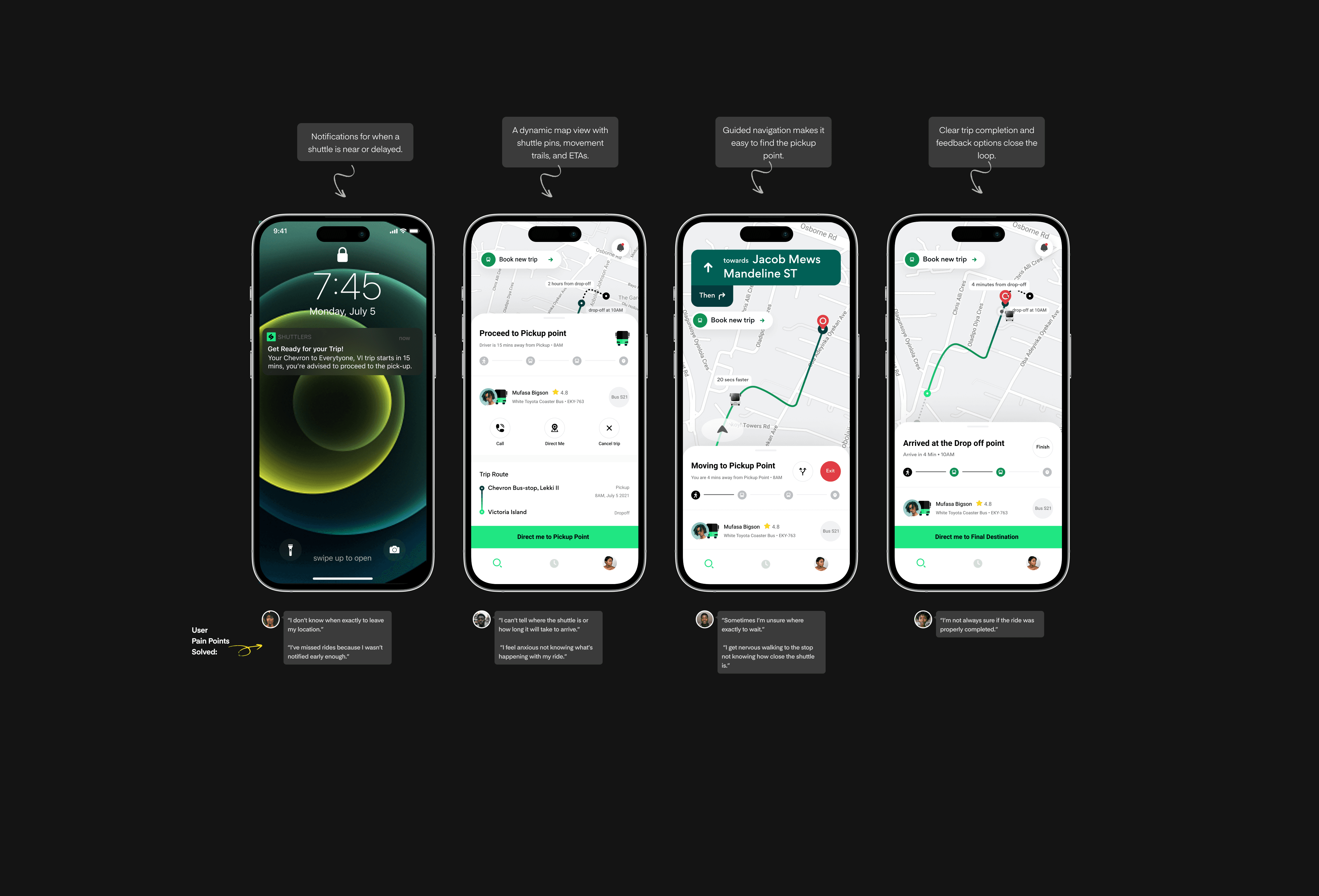
Live Shuttle Tracking & Improved ETAs
App Interface
One of the biggest trust gaps was between booking a ride and waiting for pickup. Riders would often stand anxiously at bus stops with no idea when (or if) their shuttle was coming.
I tackled this by designing a real-time shuttle tracking experience:
📍 Result: Riders now spent less time in uncertainty after booking, with a 49% drop in support tickets related to shuttle arrival issues.
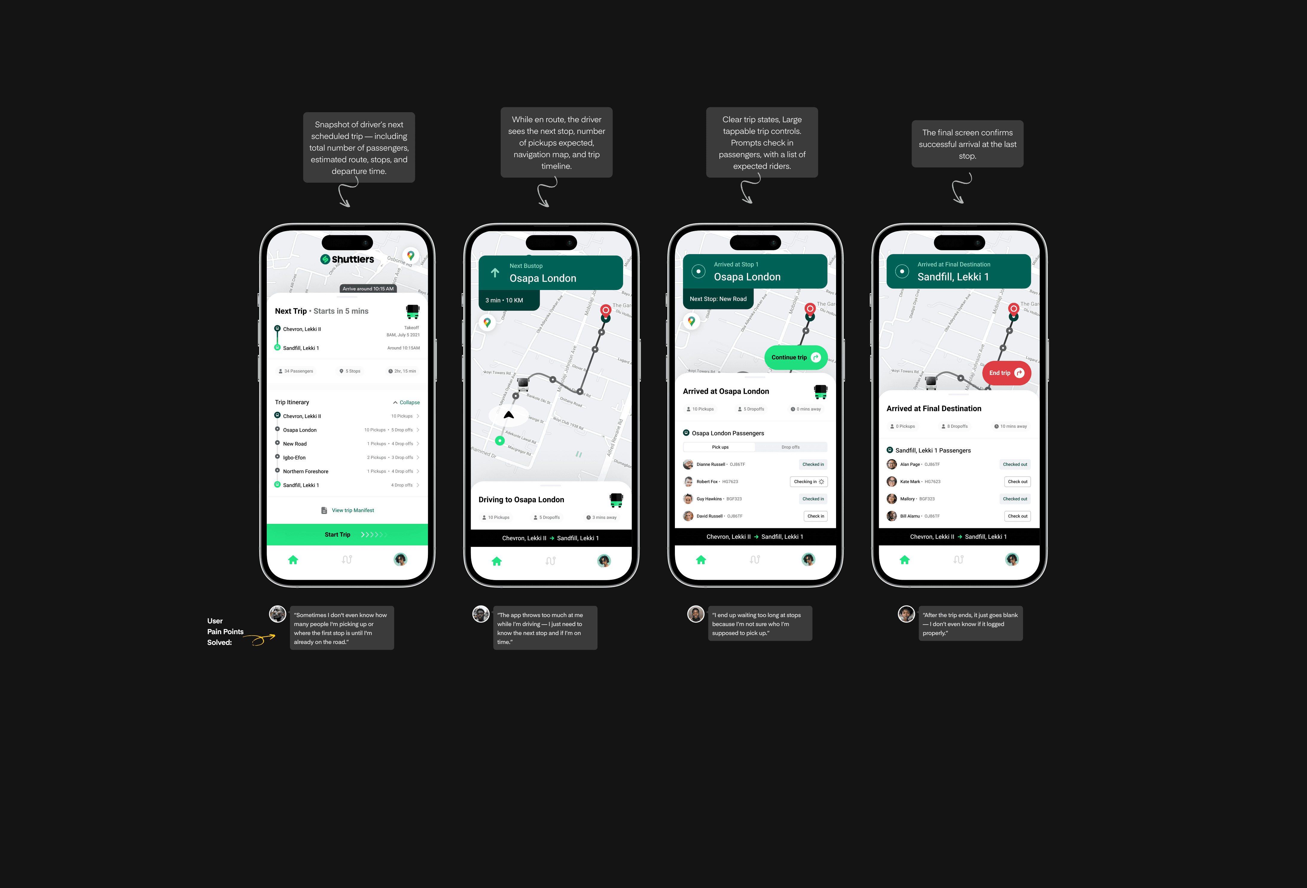
Driver App Experience
App Interface
Drivers were juggling navigation, check-ins, rider status updates, and more. The older design made this feel overwhelming.
To tackle these issues, I redesigned the driver interface with:
Clear trip states (Idle, Driving, Arrived, Completed).Large tappable trip controls.Visual summaries of remaining pickups or drop-offs.Trip Itinerary.
🚐 Outcome: Driver satisfaction improved based on internal NPS scores, and onboarding new drivers became easier thanks to clearer interfaces.
User Testing & Iteration
Data-led Design Refinements
Before any major rollout, I knew it was critical to validate not just usability, but effectiveness. The redesign wasn’t a cosmetic upgrade — it was a behaviour shift. So, we approached testing in three layers: usability sessions, internal dogfooding, and controlled A/B experiments.
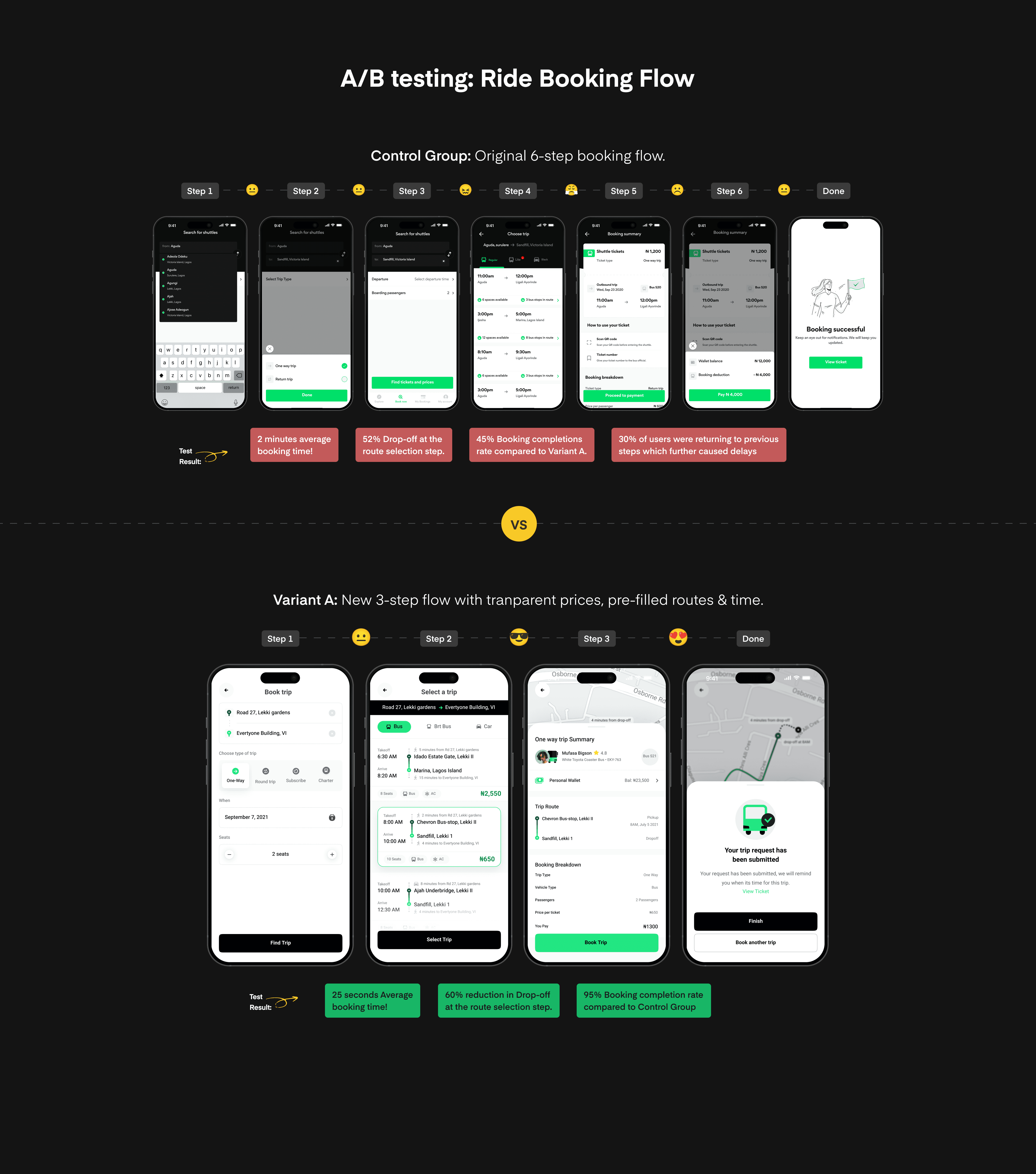
A/B Testing the Booking Flow
Unmoderated Usability Testing
I facilitated a 2-week A/B test with ~100 users split evenly between the old and new booking experience.
What we tested:
Control Group:Original 6-step booking flow.Variant A:New 3-step flow with transparent prices, pre-filled routes and time suggestions.
Results:
Booking completion
increased by 50%.Time to book
reduced by 61 secondson average.60% reductionin Drop-off at the route selection step.Riders reported more confidence in the process, with
85%saying the new flow felt“much easier”and“very clear”.
🎯 Takeaway: The new flow didn’t just reduce friction — it reintroduced confidence and trust.
Measurable Wins that Propelled the Business and User Experience
Outcome & Impact
After months of design, testing, and iteration, the new Shuttlers Customer & Driver Apps were rolled out in phases — and the results spoke louder than any design presentation.
Improved Booking Flow = More Completed Rides = Revenue
With the simplified 3-step booking experience, we saw:
Ride booking completion
increase by 22%.Average time to book reduced by
51 seconds.Drop-off at the booking stage
reduced by 60%.Fewer
“Where’s my ride?”support tickets were reported to customer support.
A Smoother Driver Experience
Trip management errors
reduced by 43%.Drivers reported that the updated interface helped them
better focuson pickup and navigation instead of battling UI friction.We saw a
3x increasein trip feedback submitted by drivers — a sign that the interface was easy and comfortable enough to interact with mid-shift.
Over 22%
increase in ride booking completion.
Over 22%
increase in ride booking completion.
Over 22%
increase in ride booking completion.
Over 22%
increase in ride booking completion.
Over 49%
reduction in bookings support tickets.
Over 49%
reduction in bookings support tickets.
Over 49%
reduction in bookings support tickets.
Over 49%
reduction in bookings support tickets.
Over 60%
reduction in Drop-Off at the booking stage.
Over 60%
reduction in Drop-Off at the booking stage.
Over 60%
reduction in Drop-Off at the booking stage.
Over 60%
reduction in Drop-Off at the booking stage.
Conclusion & Reflections
Designing for trust and everyday reliability
Designing for corporate commuters isn’t about delight — it’s about dependability and trust. Every tap, screen, and flow needs to work every single morning, often before sunrise.
This project reinforced the importance of certain good design values:
Designing
withusers, not just for them.Prioritizing
clarity, speed,andstabilityover visual flair.Using
quantitative dataas a companion toqualitative insights.
Personally, this project deepened my knowledge in translating research insights into design solutions — and proved that even small UX wins can create massive ripple effects in the real world.
Ready for the next project?
Ready for the next project?