Building design…
CourseNinja
CourseNinja
CourseNinja
Designing a Live Course Platform that Empowers Next Generation Creators to Teach and Monetize with Ease.
Designing a Live Course Platform that Empowers Next Generation Creators to Teach and Monetize with Ease.
Designing a Live Course Platform that Empowers Next Generation Creators to Teach and Monetize with Ease.
Project Details
Team:
Product Designer(Me)
5 Software Engineers
2 Product Managers
1 QA Engineer
Project Deliverables:
Hi Fidelity UI Design
Design Style Guide
Brand Design Assets
Design Documentation
My Role:
User Research
UI/UX Design
Brand Design
Prototyping & Testing
Tools:
Figma, Illustrator, Jira
Year:
2022
Overview
TL;DR
It all started with a question:
“What happens to your webinar content after the live session ends?”
As a product team at WebinarNinja, we had been laser-focused on live webinars for years. But more and more, we noticed a pattern; Our most active creators—teachers, coaches, entrepreneurs—weren’t just hosting incredible webinars, they were repackaging those content elsewhere, building evergreen funnels, and trying to monetize their knowledge. But they were hitting roadblocks — clunky tools, overwhelming platforms, and setups that felt like building Ikea furniture without instructions.
We saw an opportunity: what if we built a course platform that felt like it was designed by creators, for creators? That was the spark behind CourseNinja — and the start of one of the most exciting design journeys I’ve worked on.
What was the problem?
While WebinarNinja was thriving as a webinar platform, users were trying to stretch it beyond its intended use case. They wanted a way to organize webinar replays into structured, sellable content — without exporting files, juggling platforms, or learning new tools.
The existing product worked beautifully for live experiences — but the moment creators wanted something evergreen or on-demand, they left. For the business, that meant:
Lost engagement.Lost monetization opportunities.And most of all, a disconnected experience for learners.
What we did
We helped creators turn content into CASH!
We set out to design Courseninja; a lightweight, intuitive course-hosting platform that made it easy for creators to build, sell, and share courses — all without leaving the WebinarNinja ecosystem.
Within the first 3 months after launch:
Over 1,500 new customers signed upto create and sell courses.Revenue increased by 15%,with a significant portion attributed directly to CourseNinja.Customer satisfaction scores jumped,with feedback pouring in about how“effortless” and “seamless”the new tool felt.
Research & Discovery:
Listening Before Designing
Every good product starts with a question — and often, a bit of confusion.
When our team first floated the idea of CourseNinja, the room was split. Some thought we needed a full-scale learning management system. Others argued for a lightweight course embed tool.
I had a different hunch: before debating features, we needed to step away from our assumptions and listen deeply to our users.
So we hit pause and did what good designers do:
WE ASKED!
User Interviews:
Talking to Creators
I kicked things off with a round of user interviews, speaking with 10 power users who had been with WebinarNinja for years. They had stories — so many stories — about clunky dashboards, abandoned student emails, confusing pricing pages.
One call still sticks with me — a wellness coach named Maria.
She had been running weekly live sessions for her clients but wanted to create an evergreen course that people could buy anytime.
“I tried Teachable,” she said. “But it felt like building a spaceship just to upload a few videos.”
She wasn’t alone. A personal finance instructor told us she created a course with 7 modules… and spent two weeks just figuring out how to organize them.
“The tech became the bottleneck,” she said. “It killed my motivation.”
“I don’t need 99 features. I just want to upload my videos, set a price, and look professional.”
That was our first big “aha”: complexity kills creativity.
Our users weren’t asking for hundreds of features. They wanted tools that felt invisible — just the right amount of structure without getting in the way. That was a recurring theme: Simplicity. Professionalism. Control.
User Surveys:
Surveying the Quiet Majority
Of course, not every user has time for a 45-minute Zoom call.
So we crafted a focused product survey and sent it to 200+ WebinarNinja users.
The goal: validate patterns we were hearing in interviews — and surface new insights from the long tail of quieter users.
Some numbers that shaped our direction:
63%hadalready attemptedto build a course outside WebinarNinja.42%said they felt “overwhelmed” by existing course tools.58%said they preferred courses withfewer than 10 lessons.
The data didn’t just reinforce our instincts — it gave us confidence to say no to certain features in v1. We weren’t building the next Udemy. We were building something simpler, more focused, and far more intentional.
Competitive Analysis:
Learning What Not to Do
To round things out, I dove deep into the competition.
We created experience maps for Teachable, Thinkific, Kajabi, and Podia — clicking through their onboarding flows, feature sets, and pricing dashboards like a first-time user would.
Some of the learnings include:
Teachable gave us UI envy but buried core actions under layers of settings.
Podia had great templates but too much rigidity.
Kajabi’s power came with a steep learning curve that frustrated many creators.
We realized we had a golden opportunity that gave us a clear north star:
Build something simple, "non-techy" and creator-first.
Observations & Key Insights:
Insights That Shaped the Design
These conversations didn’t just validate a market need. They gave us the emotional texture — the real human stories — that inspired the product we were about to build.
After weeks of conversations, analysis, and sticky notes, we emerged with core thesis that became our design compass from that point forward:
Simplicity is Key for Creators
Creators want a faster, easier way to build and launch courses without tech overwhelm.
Simplicity is Key for Creators
Creators want a faster, easier way to build and launch courses without tech overwhelm.
Simplicity is Key for Creators
Creators want a faster, easier way to build and launch courses without tech overwhelm.
Simplicity is Key for Creators
Creators want a faster, easier way to build and launch courses without tech overwhelm.
Engagement & Sales Matter Most
Success is measured by student engagement and sales—not just publishing the course.
Engagement & Sales Matter Most
Success is measured by student engagement and sales—not just publishing the course.
Engagement & Sales Matter Most
Success is measured by student engagement and sales—not just publishing the course.
Engagement & Sales Matter Most
Success is measured by student engagement and sales—not just publishing the course.
Less Tech, More Efficient Control
Users are frustrated with complex setups and want built-in, automated tools.
Less Tech, More Efficient Control
Users are frustrated with complex setups and want built-in, automated tools.
Less Tech, More Efficient Control
Users are frustrated with complex setups and want built-in, automated tools.
Less Tech, More Efficient Control
Users are frustrated with complex setups and want built-in, automated tools.
Designing CourseNinja
Armed with user insights and sufficient data, I got to work — not just designing screens, but designing an experience that resonates with the users.
I kicked off with low-fidelity flows and wireframes, focusing on two user types:
Creators(course setup, pricing, content management).Learners(enrollment, progress tracking, playbacks).
I mapped out the entire experience from onboarding to course completion, refining each step for clarity and flow.
User Flow & Wireframes
Using real stories from interviews (remember Maria and her 3-step course idea?), I mapped the core journey:
Create a course.Add lessons (video, text, or both).Create Sales Page.Share with learners.
No detours. No jargon. Just action.
I created wireframes that told a story — from empty states that guided first-time users with warmth and clarity, to clear CTAs that nudged progress without pressure.
UI Foundations:
UI Assets & Design System
We wanted the product to feel familiar, yet fresh — like an old friend with a new haircut. I created a flexible component library that our engineers could plug directly into the existing WebinarNinja design system, reducing handoff time and maintaining consistency across platforms:
Soft neutrals and warm accent colors — creating a calm, premium feel.
A modular card system for lessons, videos, and modules.
Mobile-first responsive layouts.
Everything had to feel intuitive, modern, and “non-techy.”
Testing With Real Users
We conducted two rounds of usability testing with 8 creators — some existing users, some brand new to the platform:
One with mid-fidelity prototypes.
Another with high-fidelity clickable flows using Maze.
The feedback?
“The course set up flow just makes sense.”
“I didn’t have to think.”
“Feels like it was built for people like me.”
Music to a designer’s ears.
However, some users got confused by course pricing.
Through rapid iteration, I fine-tuned the designs — from button copy to onboarding microinteractions. I stripped out features that distracted and doubled down on the ones that brought momentum.
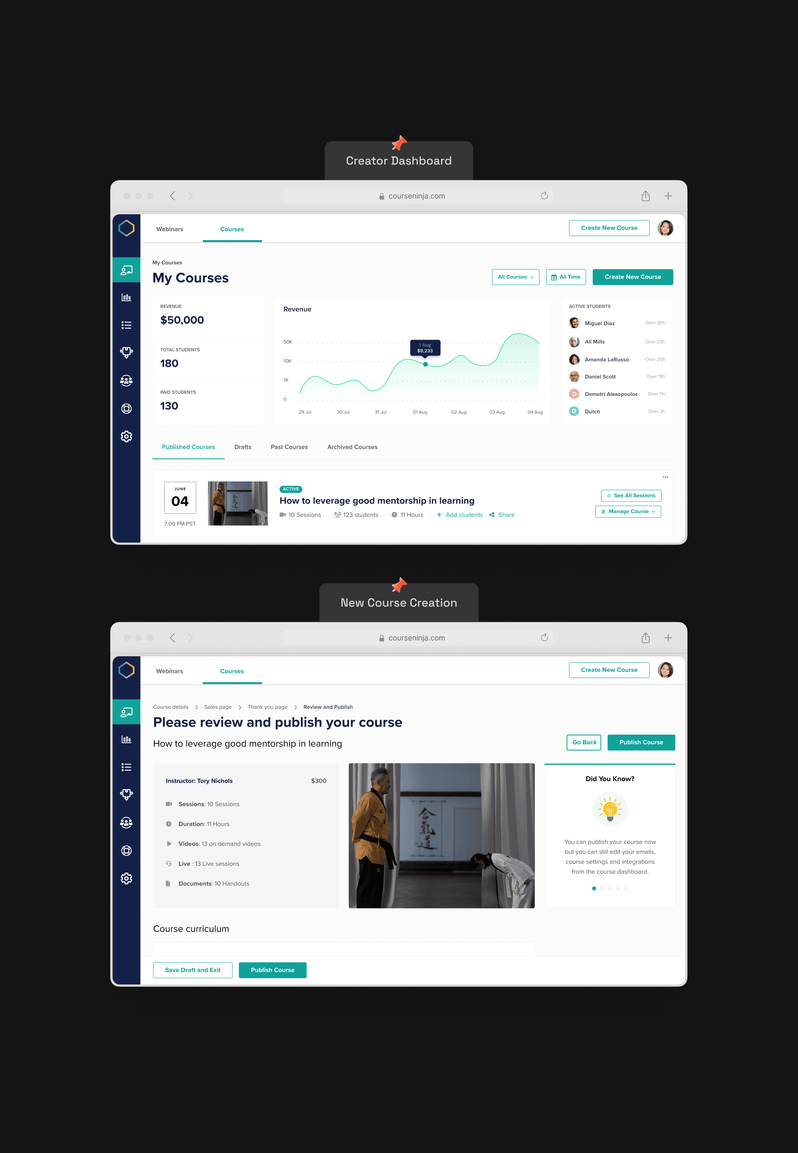
What We Shipped
App Interface
In just 6 months, we launched the CourseNinja MVP. The final interface was clean, elegant, and frictionless.
Key Features:
Instructor and Students Session rooms.
A dashboard that showed course progress and revenue at a glance.
An Intuitive course builder.
Students Stats.
Video and resource uploads.
Email automation for enrolled students.
Customizable course landing pages.
Student progress tracking.
Every component was backed by real user feedback. Nothing unnecessary.

Outcome & Impact:
Small Team, Big Wins
When we launched the first version of CourseNinja, we were cautiously optimistic. We believed in the simplicity of the product, but we knew it was entering a crowded space. What we didn’t expect was how quickly it would take off.
And because CourseNinja was seamlessly integrated into WebinarNinja’s backend, users could go from live webinars to structured courses with just a few clicks — turning passive viewers into paying students, and content into cash.
But the real win wasn’t just in the numbers — it was in the shift we saw.
Users were no longer struggling to stitch things together. They were building faster, launching quicker, and focusing more on teaching than tech.
1,500+
new customers signed up to create & sell courses in 3 months.
1,500+
new customers signed up to create & sell courses in 3 months.
1,500+
new customers signed up to create & sell courses in 3 months.
1,500+
new customers signed up to create & sell courses in 3 months.
Over 15%
boost in company revenue within the first quarter post-launch.
Over 15%
boost in company revenue within the first quarter post-launch.
Over 15%
boost in company revenue within the first quarter post-launch.
Over 15%
boost in company revenue within the first quarter post-launch.
30% Faster
course creation time, helping creators go live with ease.
30% Faster
course creation time, helping creators go live with ease.
30% Faster
course creation time, helping creators go live with ease.
30% Faster
course creation time, helping creators go live with ease.
Conclusion & Reflections:
Designing with Empathy
CourseNinja was was more than just another product design gig—it was a chance to create something meaningful for people chasing their passion. I spoke with creators who were excited but overwhelmed, motivated but unsure where to start. And I saw an opportunity to build a product that didn’t just work—but actually supported them in doing what they loved.
Leading this project gave me the space to fully lean into my strengths: listening deeply, designing with empathy, and simplifying complexity without losing power. It brought together everything I value in a good product design: thoughtful research, seamless collaboration, and user-centered outcomes that drive business results. Every decision—from the way the dashboard was structured to how the onboarding felt—was shaped by real voices and real needs.
This experience reinforced something I always carry with me as a designer:
when we design with clarity and care, we don’t just ship features—we help people move forward with confidence.
Ready for the next project?
Ready for the next project?